 ToolGrid AI
Workflows
How to check text color contrast with WCAG ratios
Use a free contrast calculation to check solid-color text, understand AA and AAA thresholds, and avoid misleading rounded results.
By ToolGrid AI Editorial Team · Published
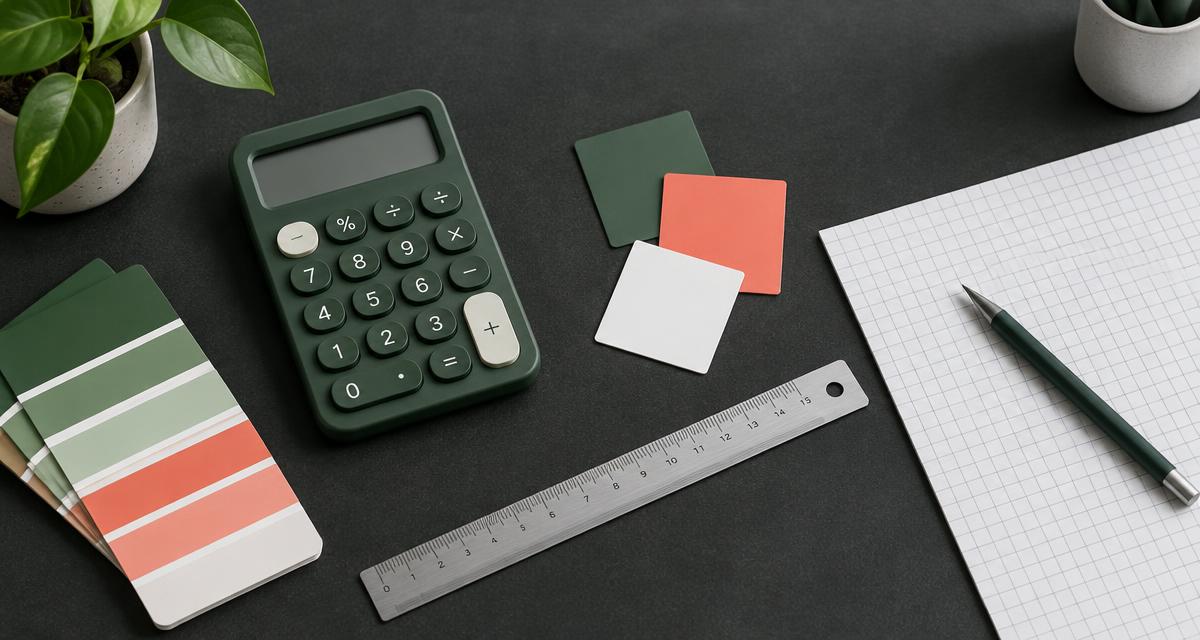
Contrast is a measurable relationship
Text contrast compares the relative luminance of foreground and background colors. It is not simply the difference between their HEX numbers. Our Color Contrast Checker accepts two six-digit sRGB HEX colors and calculates a ratio from 1:1 to 21:1.
Black and white are a useful first check: #000000 against #ffffff gives 21:1. Two identical solid colors give 1:1. The order of the pair does not change the ratio, though the visual design may still look quite different.
Know which threshold applies
WCAG 2.x Level AA requires at least 4.5:1 for normal text and 3:1 for large text, with stated exceptions. Large text means at least 18 points, or at least 14 points when bold. It does not mean any text that merely looks like a heading.
For Level AAA, normal text needs at least 7:1 and large text needs at least 4.5:1. The tool reports AA normal, AA large and AAA normal checks. These are text-contrast checks, not a full accessibility audit.
Use the actual rendered colors
Inspect the real text and background colors rather than approximating them from a screenshot. If either is transparent, the final blended color depends on what is underneath it. For text on a photo or gradient, check the least favorable area behind the letters.
Our checker assumes two opaque solid colors. It does not simulate blending, photographs, gradients, hover states or disabled controls. A passing pair therefore cannot establish that every place the same brand colors are used is accessible.
Do not round your way to a pass
The display shows two decimal places, but the pass or fail decision uses the unrounded ratio. A value just below 4.5 should fail even if it looks close to the threshold on screen. Choose a little margin instead of designing exactly on a cutoff.
Adjust one color, run the tool again and compare. Darkening the foreground or lightening the background often increases contrast, but the result depends on the actual pair. Do not rely on a rule such as “all gray text is fine.”
Contrast is only one part of readability
Adequate contrast does not fix tiny type, cramped line spacing, unclear link labels or information conveyed by color alone. Check the page with keyboard navigation, zoomed text and real users when possible.
Treat the ratio as one repeatable measurement within a broader review. It is valuable because it catches problems that personal preference can miss, not because it turns a two-color input into an accessibility certification.
Sources
Related articles
Workflows
How to convert CSV to JSON without breaking commas, quotes or leading zeros
A practical workflow for turning a spreadsheet export into JSON, with examples for quoted cells, identifiers and malformed rows.
· 2 min read

Workflows
How to reorder or delete PDF pages without uploading your document
Fix a document’s page order, remove unwanted pages and check the output without confusing page labels with page positions.
· 2 min read
Workflows
How to crop an image to exact pixels without stretching it
Understand crop coordinates, check image boundaries and choose a transparent PNG workflow for rounded corners.
· 2 min read